

Start here#
This isn’t a lesson. It’s a router.
Four questions a business actually asks, each answered on real data, each ending with the one line you could say out loud in a meeting and the place to go if you want the long version.
If you’re looking for the tutorials, they’re `cdnow_clv.ipynb <cdnow_clv.ipynb>`__ for the money side and `online_retail_ii_cohort.ipynb <online_retail_ii_cohort.ipynb>`__ for the retention side. Come back here when you want an answer rather than an education.
The map#
Your question |
Section |
What answers it |
Long version |
|---|---|---|---|
“What is a customer worth?” |
1 |
|
|
“Is this customer gone, or just quiet?” |
2 |
|
|
“Who should get the retention budget?” |
3 |
Ranking on |
|
“Why does my retention chart disagree with Marketing’s?” |
4 |
|
|
“Can I even run this on my data?” |
0 |
Three checks, below |
— |
Every name in that table gets imported and called further down, so if one of them is renamed or removed this notebook stops running and CI goes red. The map can’t quietly stop matching the library.
0. Before any of this: can you run it at all?#
Three things have to be true of your transaction log. None of them is about statistics; they’re about whether the data can identify anything.
Enough customers bought more than once. These models learn the repeat pattern. A base where nobody came back has no pattern to learn.
Enough calendar time. A customer acquired last week hasn’t had the chance to lapse, so a log that’s three weeks long can’t tell loyal from new.
Amounts that are actually amounts. Refunds, zero-value rows and test orders will quietly become someone’s average spend.
The cell below checks all three and refuses rather than guesses. Point it at your own log by swapping the DataFrame.
[1]:
from pathlib import Path

import matplotlib.pyplot as plt
import numpy as np
import pandas as pd

from clvkit import CLV, CohortMatrix, CustomerBase

SURFACE, INK, MUTED = "#fcfcfb", "#0b0b0b", "#52514e"
NAIVE, ACTUAL, MODEL = "#eb6834", "#0b0b0b", "#2a78d6"

REPO = next(
    p for p in [Path.cwd(), *Path.cwd().parents] if (p / "CDNOW_sample.txt").exists()
)


def readiness(log, *, customer_id="customer_id", date="date", amount="amount"):
    """Three yes/no checks, and the numbers behind them."""
    per_customer = log.groupby(customer_id)[date].agg(["min", "max", "count"])
    repeat = int((per_customer["count"] > 1).sum())
    span_days = (log[date].max() - log[date].min()).days
    bad_amounts = int((log[amount] <= 0).sum())

    return pd.DataFrame(
        [
            (
                "repeat buyers",
                f"{repeat:,} of {len(per_customer):,}",
                "need 100+, and >5% of the base",
                repeat >= 100 and repeat / len(per_customer) > 0.05,
            ),
            (
                "calendar span",
                f"{span_days:,} days",
                "need ~3x your typical repurchase gap",
                span_days >= 180,
            ),
            (
                "non-positive amounts",
                f"{bad_amounts:,} rows",
                "decide net / drop / raise before fitting",
                bad_amounts == 0,
            ),
        ],
        columns=["check", "your data", "rule of thumb", "ok"],
    ).set_index("check")


log = pd.read_csv(
    REPO / "CDNOW_sample.txt",
    sep=r"\s+",
    header=None,
    names=["master_id", "customer_id", "date", "quantity", "amount"],
)
log["date"] = pd.to_datetime(log["date"], format="%Y%m%d")

readiness(log)
[1]:
| your data | rule of thumb | ok | |
|---|---|---|---|
| check | |||
| repeat buyers | 1,152 of 2,357 | need 100+, and >5% of the base | True |
| calendar span | 545 days | need ~3x your typical repurchase gap | True |
| non-positive amounts | 8 rows | decide net / drop / raise before fitting | False |
CDNOW passes the first two and fails the third: 8 rows have a zero dollar value. That’s not fatal, it’s a decision. CustomerBase takes on_negative="net" (default, nets spend within a period and leaves purchase timing alone), "drop", or "raise" if you’d rather be told than have it handled. Whatever a policy nets away or discards, the summary reports with a counted warning — on this log it will say 8 events kept their timing and contribute no spend.
A failing row here doesn’t mean stop. It means decide, and write down what you decided.
1. What is a customer worth?#
You already have a formula for this, and it’s probably some version of
value = average ticket x purchase frequency x margin
taking each customer’s historical rate and extending it forward. It’s a reasonable thing to do. Let’s run it and find out how wrong it is.
The test is honest: fit on CDNOW’s first 39 weeks, predict the next 39, then compare both answers to what those customers actually spent in weeks 40 to 78. Neither method sees the holdout.
[2]:
cb = CustomerBase.from_transactions(log, time_unit="W", collapse="D")
calibration, holdout = cb.split(calibration_period_end="1997-09-30")

c = calibration.to_pandas()
weeks_ahead = int(holdout["duration_holdout"].iloc[0])

# Your formula: each customer's own repeat rate, extended over the next 39 weeks.
rate = (c["frequency"] / c["T"]).replace([np.inf, -np.inf], 0).fillna(0)
naive = (rate * weeks_ahead * c["monetary_value"]).sum()

# What actually happened in those 39 weeks.
actual = (holdout["frequency_holdout"] * holdout["monetary_value_holdout"]).sum()

# What clvkit predicts, fitted on the same 39 weeks and nothing else.
model = CLV().fit(calibration).predict(horizon=weeks_ahead, discount_rate=0.0)
predicted = model.to_pandas()["clv"].sum()

pd.DataFrame(
    {
        "revenue over weeks 40-78": [f"${v:,.0f}" for v in (naive, actual, predicted)],
        "error": [f"{naive / actual - 1:+.1%}", "", f"{predicted / actual - 1:+.1%}"],
    },
    index=["your formula", "what actually happened", "clvkit"],
)
[2]:
| revenue over weeks 40-78 | error | |
|---|---|---|
| your formula | $114,396 | +61.2% |
| what actually happened | $70,976 | |
| clvkit | $59,931 | -15.6% |
[3]:
fig, ax = plt.subplots(figsize=(8, 3.6))
fig.patch.set_facecolor(SURFACE)
ax.set_facecolor(SURFACE)

bars = {
    "your formula": (naive, NAIVE),
    "what actually\nhappened": (actual, ACTUAL),
    "clvkit": (predicted, MODEL),
}
for i, (value, colour) in enumerate(bars.values()):
    ax.bar(i, value, width=0.55, color=colour)
    ax.text(i, value + 2500, f"${value:,.0f}", ha="center", fontsize=11, color=INK)

ax.axhline(actual, color=ACTUAL, lw=1, ls=(0, (4, 4)))
ax.set_xticks(range(3), bars.keys(), fontsize=10)
ax.yaxis.set_major_formatter(lambda v, _: f"${v / 1000:,.0f}k")
ax.set_ylabel("Revenue, weeks 40-78", color=MUTED)
ax.set_title("Predicting 39 weeks nobody had seen yet", loc="left")
ax.set_ylim(0, naive * 1.18)
for side in ("top", "right"):
    ax.spines[side].set_visible(False)
ax.spines["left"].set_color("#d8d7d2")
ax.spines["bottom"].set_color("#d8d7d2")
ax.tick_params(colors=MUTED)
fig.tight_layout()
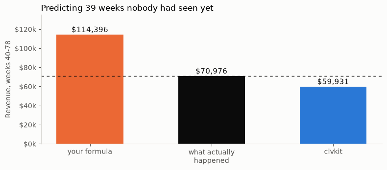
Your formula overshoots by 61%. It projects $114k against the $71k that actually arrived.
The reason is structural, not arithmetic. A historical rate assumes everybody keeps buying at the rate they’ve bought so far, and about half of any retail base has already quietly stopped. The formula has no way to represent “gone”, so it bills you for customers who are never coming back.
clvkit lands at $60k, which is 16% low. It is wrong too. It’s wrong by a quarter as much, and it’s wrong in the safe direction, but anyone telling you this is the number is selling something.
Say this in the meeting: “Our current LTV number assumes nobody ever churns. On our own history it overstates the next nine months by about 60%. Here’s the version that models churn, and it’s still 16% off, so let’s treat it as a range.”
Long version: `cdnow_clv.ipynb <cdnow_clv.ipynb>`__.
2. Is this customer gone, or just quiet?#
Nobody cancels anything at a retailer. There’s no churn event to count, only silence, and silence means different things for different customers. Somebody who buys every eight weeks and hasn’t bought in ten is quiet. Somebody who bought twice in a fortnight two years ago is gone.
probability_alive() is the model’s answer, and it’s a probability, not a label.
[4]:
clv = CLV().fit(cb)
scored = cb.to_pandas().assign(
    p_alive=clv.transaction_model.probability_alive().to_pandas(),
    weeks_silent=lambda d: (d["T"] - d["recency"]).round(1),
)

scored.loc[[1673, 983, 17, 751]][
    ["frequency", "recency", "T", "weeks_silent", "p_alive"]
].round(2)
[4]:
| frequency | recency | T | weeks_silent | p_alive | |
|---|---|---|---|---|---|
| customer_id | |||||
| 1673 | 2 | 65.29 | 69.29 | 4.0 | 0.84 |
| 983 | 1 | 47.43 | 72.57 | 25.1 | 0.73 |
| 17 | 12 | 52.86 | 77.86 | 25.0 | 0.22 |
| 751 | 12 | 39.71 | 73.71 | 34.0 | 0.02 |
Those four rows are the whole base in miniature. Here it is in full — weeks of silence on the x-axis, each customer’s repeat-purchase count in colour. Every result in clvkit plots itself, so this is one line:
[ ]:
fig, ax = plt.subplots(figsize=(8, 4.4))
clv.transaction_model.probability_alive().plot(ax=ax)
fig.tight_layout()
Look at customers 983 and 17. They have been silent for the same 25 weeks, and the model says 0.73 against 0.22.
The difference is everything they did before that. Customer 983 bought twice, so a six-month gap is his normal. Customer 17 bought thirteen times, so a six-month gap is behaviour that has never happened to him before. Customer 751 is the same story further along: thirteen purchases, 34 weeks of silence, 0.02.
The heavier buyers are the ones the model has written off. That’s the whole idea. Silence is read against that customer’s own rhythm, not against a company-wide threshold, so the same 25 weeks means “normal” for one and “something broke” for the other.
Which is why a CRM rule like “no order in 6 months, send the win-back” fires at exactly the wrong moment. It’s far too late for 751, whose behaviour broke months ago, and premature for 983, who was never a frequent buyer to begin with.
Say this in the meeting: “Silence isn’t churn. A customer who ordered every three weeks and has gone quiet for eight months is a different problem from one who orders twice a year. Our current rule treats them identically.”
Long version: `cdnow_clv.ipynb <cdnow_clv.ipynb>`__, section 7.
3. Who should get the retention budget?#
The default answer is “our best customers”, and the default definition of best is lifetime spend to date. Here’s what that list costs you.
Take the top 10% by historical spend, take the top 10% by predicted future value, and look at the customers who make one list but not the other.
[5]:
past_spend = log.groupby("customer_id")["amount"].sum().rename("past_spend")
future = CLV().fit(cb).predict(horizon=52, discount_rate=0.0).to_pandas()["clv"]

ranked = scored.join(past_spend).join(future)
top_n = int(len(ranked) * 0.10)

by_past = set(ranked.nlargest(top_n, "past_spend").index)
by_future = set(ranked.nlargest(top_n, "clv").index)
only_past = sorted(by_past - by_future)

pd.DataFrame(
    {
        "customers": [len(by_past & by_future), len(only_past)],
        "mean P(alive)": [
            ranked.loc[sorted(by_past & by_future), "p_alive"].mean(),
            ranked.loc[only_past, "p_alive"].mean(),
        ],
        "mean predicted value": [
            ranked.loc[sorted(by_past & by_future), "clv"].mean(),
            ranked.loc[only_past, "clv"].mean(),
        ],
    },
    index=["on both lists", "top spenders only"],
).round(2)
[5]:
| customers | mean P(alive) | mean predicted value | |
|---|---|---|---|
| on both lists | 175 | 0.81 | 228.37 |
| top spenders only | 59 | 0.24 | 21.99 |
59 of your 234 top spenders, a quarter of the VIP list, do not appear in the top decile by predicted value. Their mean P(alive) is 0.24 and their mean predicted next-year value is $22, against $228 for the ones who make both lists. That’s a tenfold difference in what the next campaign can expect back.
They earned their place on the list. They spent that money. It’s just already spent, and a loyalty tier built on lifetime-to-date is a monument to it.
The honest caveat: the 175 on both lists are the same people either way, so this is not an argument that past spend is useless. It’s an argument that the last quarter of the list is where the waste concentrates.
Say this in the meeting: “About a quarter of our VIP segment has a 24% chance of still being active. We’re spending retention budget on people who already left. Ranking on predicted value instead of lifetime spend moves that budget to customers worth ten times more.”
4. Why does my retention chart disagree with Marketing’s?#
Almost always one specific bug, and it’s not a modelling disagreement. It’s what happened to the empty cells.
A cohort matrix is a triangle. The cohort acquired 24 months ago has 24 months of history; the cohort acquired last month has one. The cells past a young cohort’s lifetime are not zero. They haven’t happened. If you average a column that mixes real numbers with those empty cells, you’re telling the spreadsheet that every young cohort churned on schedule.
The log below is generated, not real, for one reason: this needs many cohorts and the real multi-cohort dataset is a 43 MB download that lives in the sibling notebook. Every cohort in it retains identically by construction. There is no trend. Watch a trend appear anyway.
[6]:
rng = np.random.default_rng(0)
months = pd.period_range("2023-01", "2024-12", freq="M")

rows = []
for start, first_month in enumerate(months):
    for _ in range(120):  # 120 new customers every month, same behaviour
        customer = len(rows) and rows[-1][0] + 1 or 1
        rows.append((customer, first_month.to_timestamp(), 40.0))
        for ahead in range(1, len(months) - start):
            if rng.random() < 0.34 * np.exp(-0.045 * ahead):
                rows.append((customer, months[start + ahead].to_timestamp(), 40.0))

generated = pd.DataFrame(rows, columns=["customer_id", "date", "amount"])
matrix = CohortMatrix.from_transactions(generated, period="M", metric="retention")
rates = matrix.to_pandas(relative=True)

print(repr(matrix))
rates.iloc[:4, :7].round(3)
<CohortMatrix 'retention' 24 cohorts x 24 'M' periods>
[6]:
| period_number | 0 | 1 | 2 | 3 | 4 | 5 | 6 |
|---|---|---|---|---|---|---|---|
| cohort | |||||||
| 2023-01 | 1.0 | 0.325 | 0.325 | 0.242 | 0.217 | 0.317 | 0.242 |
| 2023-02 | 1.0 | 0.350 | 0.258 | 0.233 | 0.308 | 0.225 | 0.217 |
| 2023-03 | 1.0 | 0.308 | 0.267 | 0.342 | 0.267 | 0.300 | 0.283 |
| 2023-04 | 1.0 | 0.258 | 0.342 | 0.292 | 0.300 | 0.242 | 0.192 |
[7]:
month = 12
observed = rates[month].dropna()

pd.DataFrame(
    {
        "month-12 retention": [
            observed.mean(),
            rates[month].fillna(0).mean(),
            rates[month].mean(),
        ],
        "cohorts it used": [len(observed), len(rates), len(observed)],
    },
    index=[
        "correct: average the cohorts old enough to have a month 12",
        "wrong: fillna(0) first, so young cohorts count as churned",
        "same as correct, but the sample size is not what you think",
    ],
).round(3)
[7]:
| month-12 retention | cohorts it used | |
|---|---|---|
| correct: average the cohorts old enough to have a month 12 | 0.192 | 12 |
| wrong: fillna(0) first, so young cohorts count as churned | 0.096 | 24 |
| same as correct, but the sample size is not what you think | 0.192 | 12 |
[8]:
# Month 0 is 1.0 by construction, so the curve starts at month 1.
correct = rates.apply(lambda col: col.dropna().mean())[1:]
zero_filled = rates.fillna(0).mean()[1:]

fig, ax = plt.subplots(figsize=(9, 4))
fig.patch.set_facecolor(SURFACE)
ax.set_facecolor(SURFACE)

ax.plot(
    correct.index,
    correct,
    color=MODEL,
    lw=2.5,
    marker="o",
    ms=5,
    label="correct: only cohorts that reached this month",
)
ax.plot(
    zero_filled.index,
    zero_filled,
    color=NAIVE,
    lw=2.5,
    marker="s",
    ms=5,
    label="fillna(0): unobserved counted as churned",
)

ax.annotate(
    f"{correct[12]:.0%}",
    (12, correct[12]),
    textcoords="offset points",
    xytext=(0, 12),
    ha="center",
    fontsize=10,
    color=MODEL,
)
ax.annotate(
    f"{zero_filled[12]:.0%}",
    (12, zero_filled[12]),
    textcoords="offset points",
    xytext=(0, -20),
    ha="center",
    fontsize=10,
    color=NAIVE,
)

ax.set_xlabel("Months since acquisition", color=MUTED)
ax.set_ylabel("Retention rate", color=MUTED)
ax.set_title(
    "Every cohort here decays identically. One line says otherwise.", loc="left"
)
ax.set_ylim(0, 0.36)
ax.legend(frameon=False, fontsize=9)
for side in ("top", "right"):
    ax.spines[side].set_visible(False)
ax.spines["left"].set_color("#d8d7d2")
ax.spines["bottom"].set_color("#d8d7d2")
ax.tick_params(colors=MUTED)
fig.tight_layout()
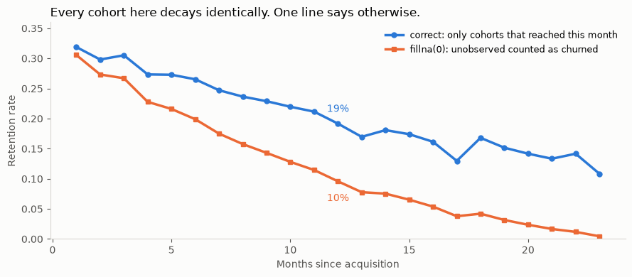
Month-12 retention is 19.2% or 9.6% depending on which line you drew, and the orange one is a fabrication.
Both lines slope down, and that part is real: customers do lapse as a cohort ages, and the blue line is that genuine decay. What the orange line adds on top is fake. The gap between them is entirely young cohorts being counted as churned for months they simply haven’t lived through, and it widens the further right you look, because the further right you look the more cohorts are too young to be there. By month 18 the wrong number is a quarter of the right one.
The blue line goes ragged past month 15 for the same reason. It isn’t measuring anything unstable, it’s averaging fewer and fewer cohorts, until month 23 is a single cohort. That’s the quieter version of the bug, sitting in the third row of the table above: .mean() skips NaN and gives the correct answer, but “month-23 retention is 10.8%” is one cohort’s fate quoted as a company-wide rate.
CohortMatrix returns NaN rather than 0 exactly so that .mean() is right by default and .fillna(0) has to be typed on purpose.
Say this in the meeting: “Both charts come from the same data. One of them counts months our newer cohorts haven’t lived through yet as months they churned. Month-12 retention is 19%, not 10%, and anything past month 15 on that chart is two or three cohorts, not the company.”
Long version: `online_retail_ii_cohort.ipynb <online_retail_ii_cohort.ipynb>`__.
What to read next#
You now have four numbers and four sentences. If you want to know why any of them is true:
`cdnow_clv.ipynb<cdnow_clv.ipynb>`__ builds the vocabulary from scratch, reproduces published parameter estimates on a benchmark dataset, puts intervals on those estimates withparameter_uncertainty, and shows what it costs to feed the model an RFM-stylerecencycolumn by mistake.`online_retail_ii_cohort.ipynb<online_retail_ii_cohort.ipynb>`__ builds a cohort matrix by hand on six customers, then runs the same operation on 5,878 real ones.``opinions.md`` in the repo root separates what the literature settles from what this library chose, for every default the four answers above accepted silently.
The one thing worth carrying out of here: every number above is a prediction with an error bar, including the ones from this library. The argument for the model isn’t that it’s right. It’s that its error was measured against data it hadn’t seen, and the alternative’s wasn’t.